Mrs. C's Art Class Spring 2013
This post is going to be: In Process
Class one- She spent the class discussion the different proportions of the human body in drawing; depending on what type of drawing you are doing--- in a normal figure drawing class, the ratio would be that the length of the body would be 7 heads long. In Manga it would be X, in Marvel Comics then it is longer still, close to 10 or so. I didn't take notes on this, and Manga and Marvel aren't my thing...but it was interesting and a lot of the students in the class are interested in that information.
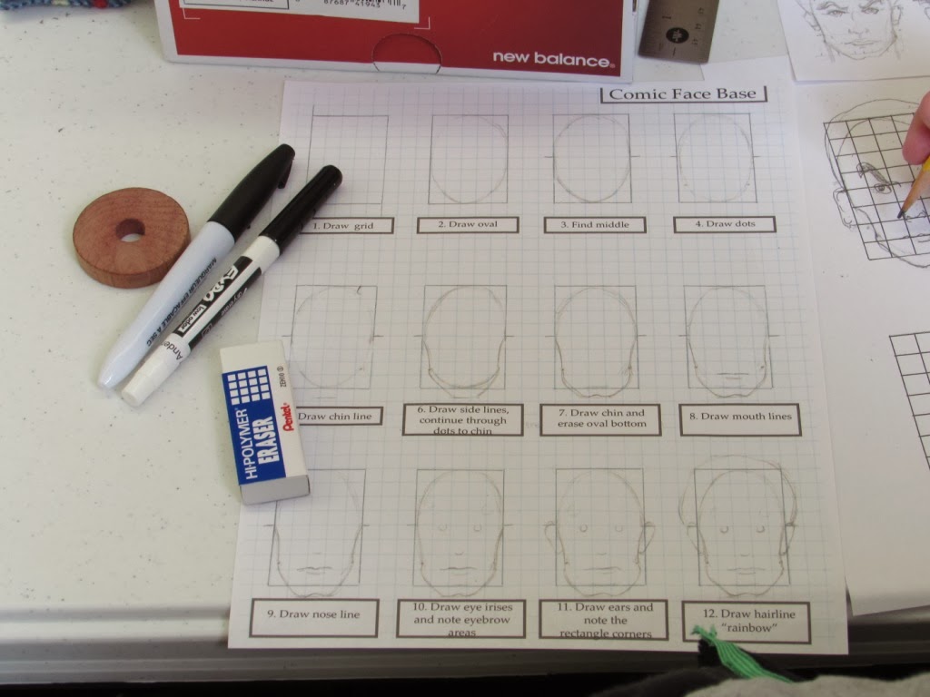
Then she had them work on getting down the stereotypical proportions for the 'average' human body in "figure drawing'. She had a form / graph printed on a white sheet of paper and put that inside a SHEET PROTECTOR. Then the students would trace or draw on top of the sheet protector with a DRY ERASE MARKER; and then they could erase their mistakes with a piece of cloth.
I will try to take a picture of her form and post it. She did a good job giving the students a good idea of where the head, neck, shoulders, arms, wrists, etc. hit and line up along the body.
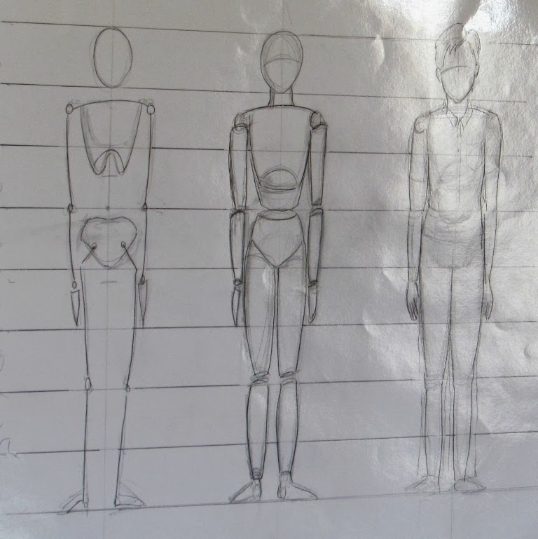
Class Two: The had the students draw a "Hang-Man" stick figure, and then proceed to show them how disproportionate that drawing it. Then she re-discussed how the human body is typically 7 heads long/tall....if you don't know what I am saying pick up a pencil and a piece of paper--then draw 7 circles of the exact same size one on top of the other, vertically, up, like building a snowman, draw your circles very lightly, the top circle is the real head of the figure and the bottom 6 make up the rest of the body--the neck all the way down to the heel, the feet actually angle off and farther down past that last circle a little bit; but the heel would stop at the circle hitting the floor.
She did a really good job of making sure she pointed out that this is just a AVERAGE, b/c as YOU know; we are all so very DIFFERENT...and this is just a drawing exercise to help teach your eye (and hand) how to get some practice. Some people are (or is it "most") not going to fit into this proportional measure.
Now for the fun activity:
1) She had the students pick out 2-3 magazine cut outs; specifically ones that had the whole body there.
2)Then put the magazine sheet INSIDE their plastic SHEET PROTECTOR ,
3)and get out their DRY ERASE MARKER
4)Draw a circle where the head is
5)draw a tiny circle for each of the two collar bones, then a line connecting them
6)draw a tiny circle/dot for the elbows, and a line connecting the elbows to the collar bone
7)draw a circle where the wrists are, and a line connecting the wrist to the elbow
8)draw a circle where the belly button is
9)draw a circle where each hip bone is
10)draw a circle where each knee is, and draw a line from the hip circle to the knee circle
11)draw a circle for each of the ankles, draw a line from the ankle to the knee
12) draw a line from the ankle circle to the end of the toes
****
Then remove the magazine from inside the sheet protector and you will see just the stick figure form you drew; which is pretty interesting and in good proportion! Then she suggested that the students take a sheet of regular white paper and a pencil and draw their stick figures onto a that piece of paper.
The drawing without the magazine inside the sheet protector.
The magazine cut-out was of the Statue of Liberty.
This activity helps the students to get better at drawing figures in correct proportions.
This class was on the differences between Comic and Manga. Some of the classifications written on the board were:
Comic Illustrations are known for the following things: Action/Adventure, Divide & Conquer, Ongoing storyline, Set formula, Mass Productions (similar to McDonalds productions), Lots of Color, Dialogue Bubbles, Snapshots of expressions, Limited Frames, Focus on details--left to right.
Manga Illustrations are known for the following things:
Any genre & novels, One Artist or writer, Creative as Possible, Crazy and Wild composition--original, Black and White Tones, Dialogue that is Integrated, Fluidity of Emotions, Less Detail, Top to Bottom--right to left...
In class on 2-20-14; Mrs. Cole's gave a presentation on Manga--here are my class notes:
Manga started in Asia; impromptu sketches - whimsical. Francis Barlow printed sequential plates; then William Hobath -1700's- A Rake's Progress- Series of Progress. Series of plates, illustrations, Matt & Jeff 1904 or 1907. Astro Boy creator watched women in theater plays. Maybe that is why his characters are so feminine. Then Western comics influenced Asian Manga.
....


No comments:
Post a Comment
Note: Only a member of this blog may post a comment.